A New Lease On Property Management.
Logo | Identity | Motion-Graphics | Print | Micro-sites
When Blake and Brady Hyde set out to create a new property management company, they wanted a name and identity that stood out. Inspired by the “Ipso” brand, they challenged us to find something equally as clean and concise. We explored names that conveyed a sense of ease, flexibility, and approachability. As an energetic, shorthand nod to property management, “Props” popped among our shortlist. Blake and Brady immediately saw the potential, and “Props Management” was born.
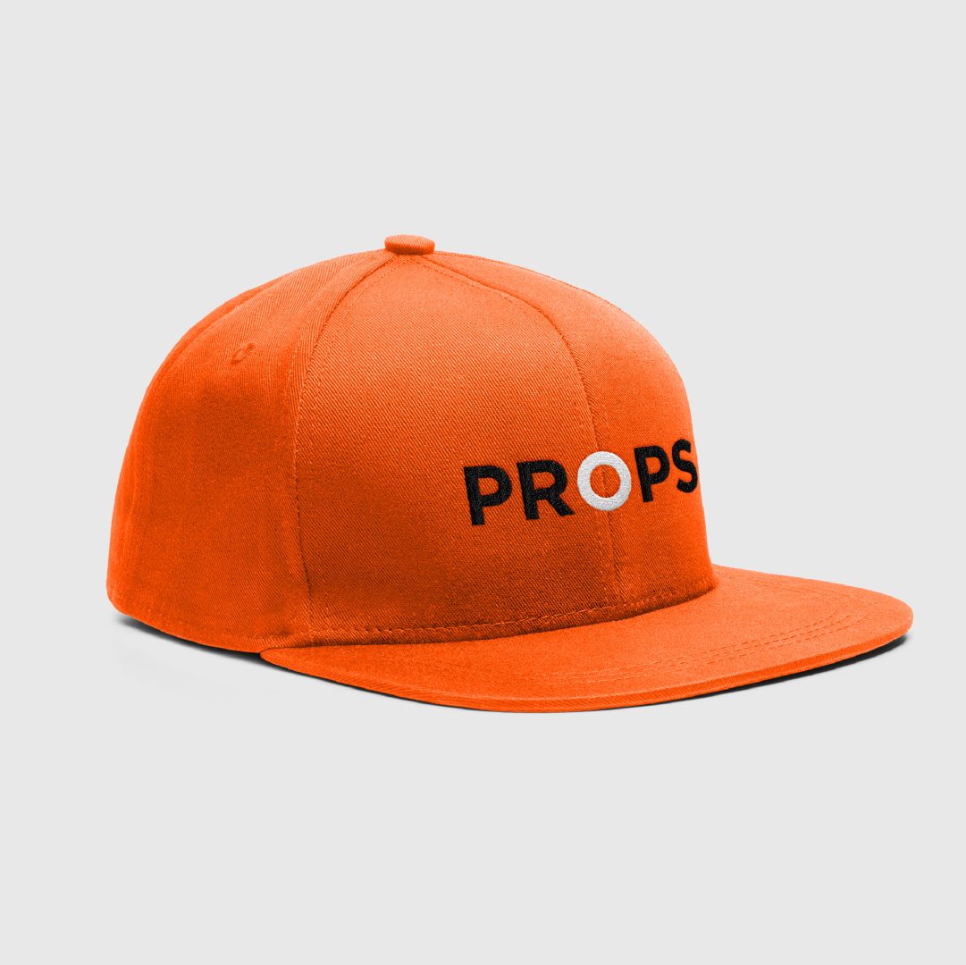
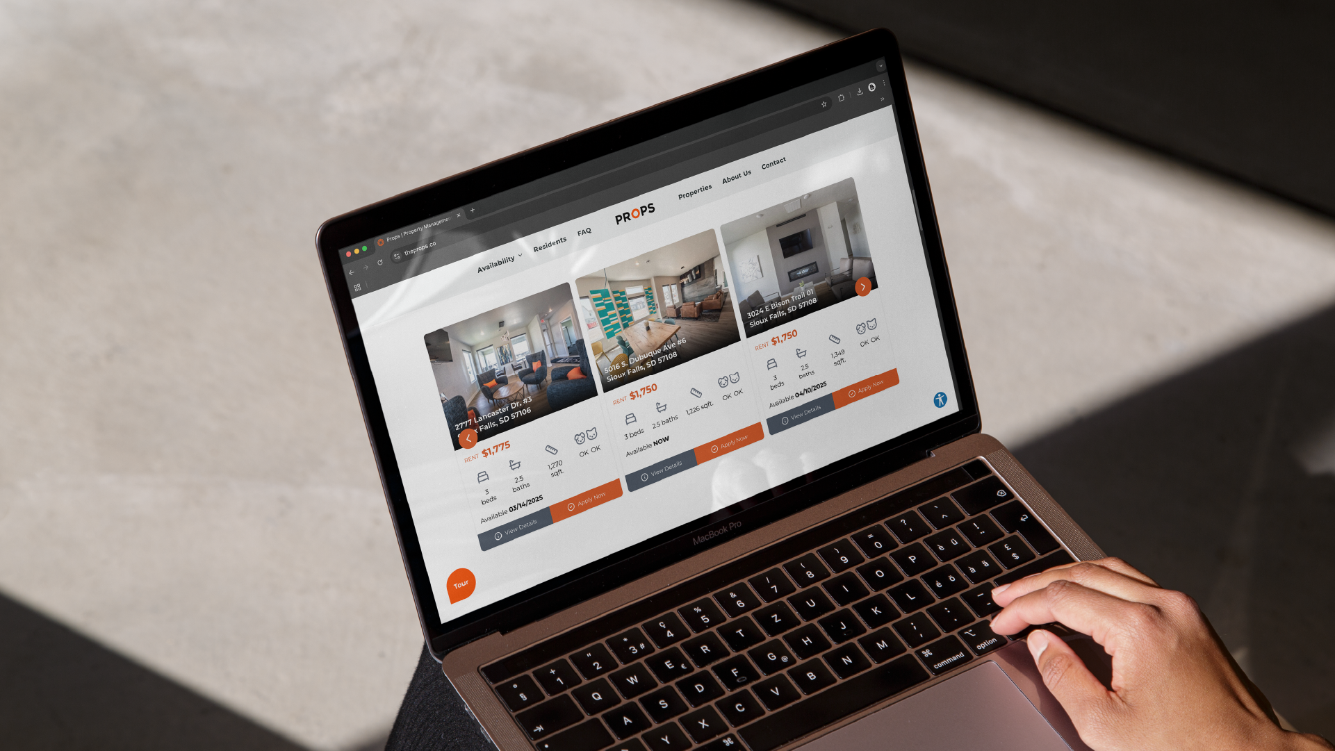
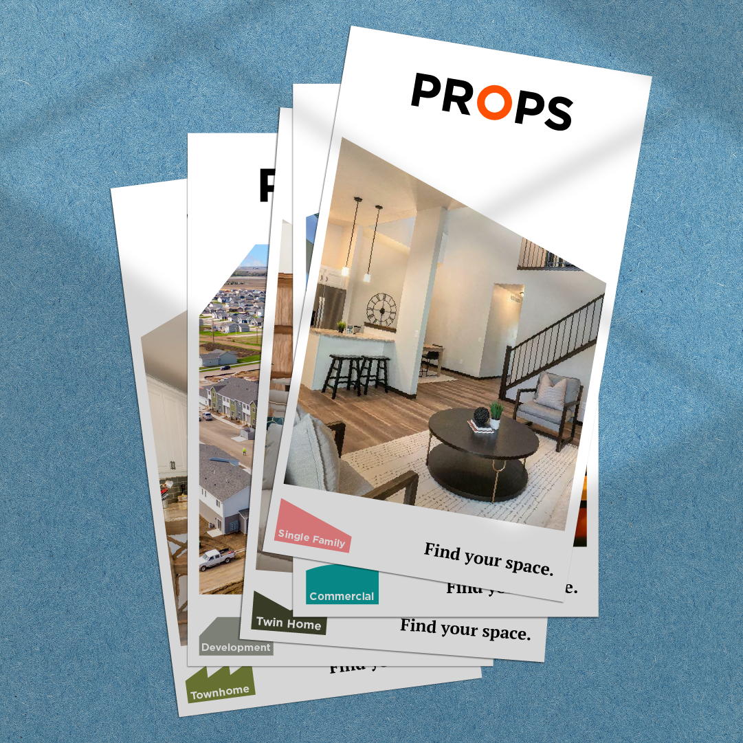
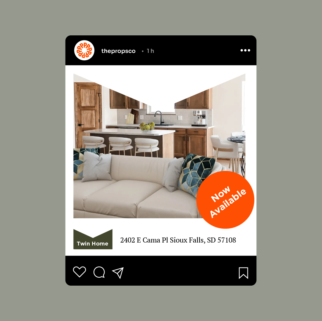
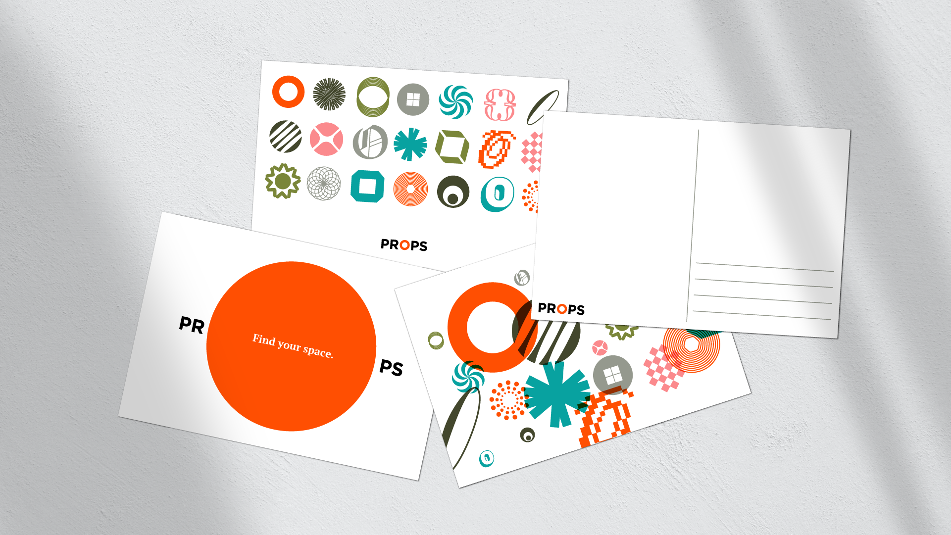
The visual identity features a pop of orange—an underutilized color in the industry—to create the brand’s bright signature. Instead of an icon, we opted for a distinctive word mark, leveraging the perfectly centered “O” as a design element. This flexibility allows the “O” to transform—becoming a floor plan, changing sizes, or even adapting to different property styles and personalities. The brand’s versatility extends into the digital space, with not just one but nine websites. Partnering with AppFolio, a property management software expert, streamlined the process. This collaborative effort meant the launch was seamless, on time, and on budget.


