The Name that Stays
Rebrand | Logo | Identity | Video
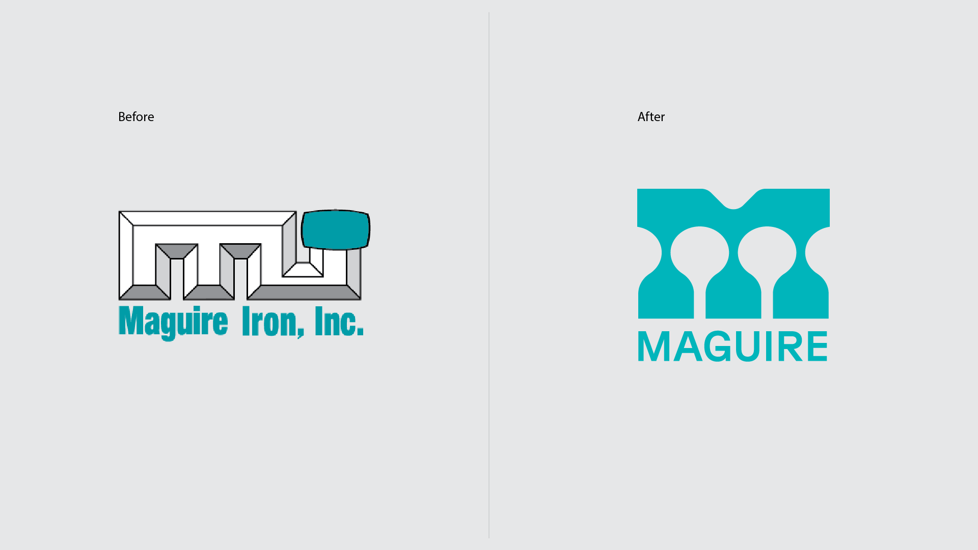
The construction of a cutting-edge fabrication and corporate office campus located north of Sioux Falls created an opportunity for Maguire to reconsider their brand. Known as Maguire Iron, “Maguire” was no longer the name of the family that owned the company, and “Iron” created market confusion. It was time for a refresh. Maguire enlisted the Fresh Produce Broadstrokes℠ process to help them Discover, Articulate, and Share their company values. We discovered that, while it was easy to lose the “Iron,” “Maguire” is the name that stays since it means a lot to people inside and outside of company walls.
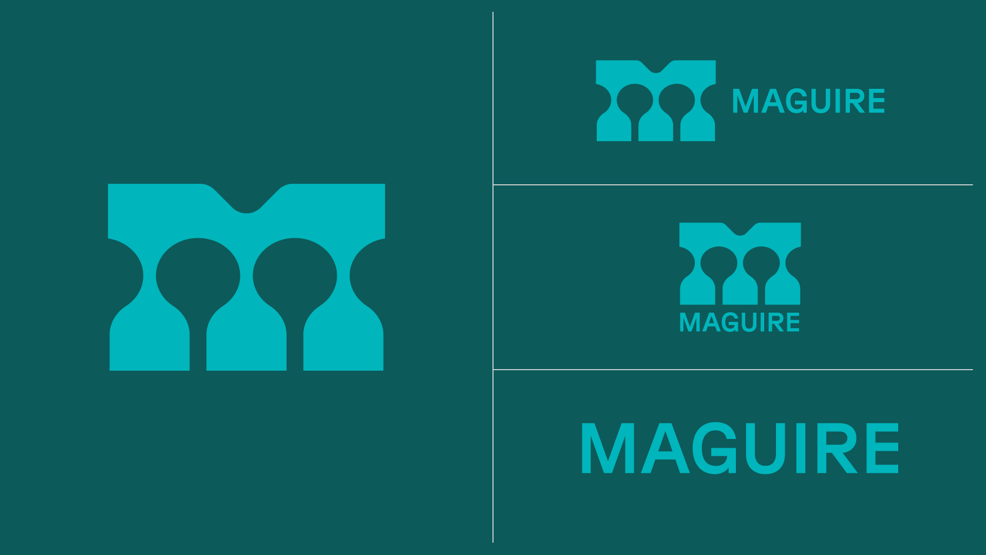
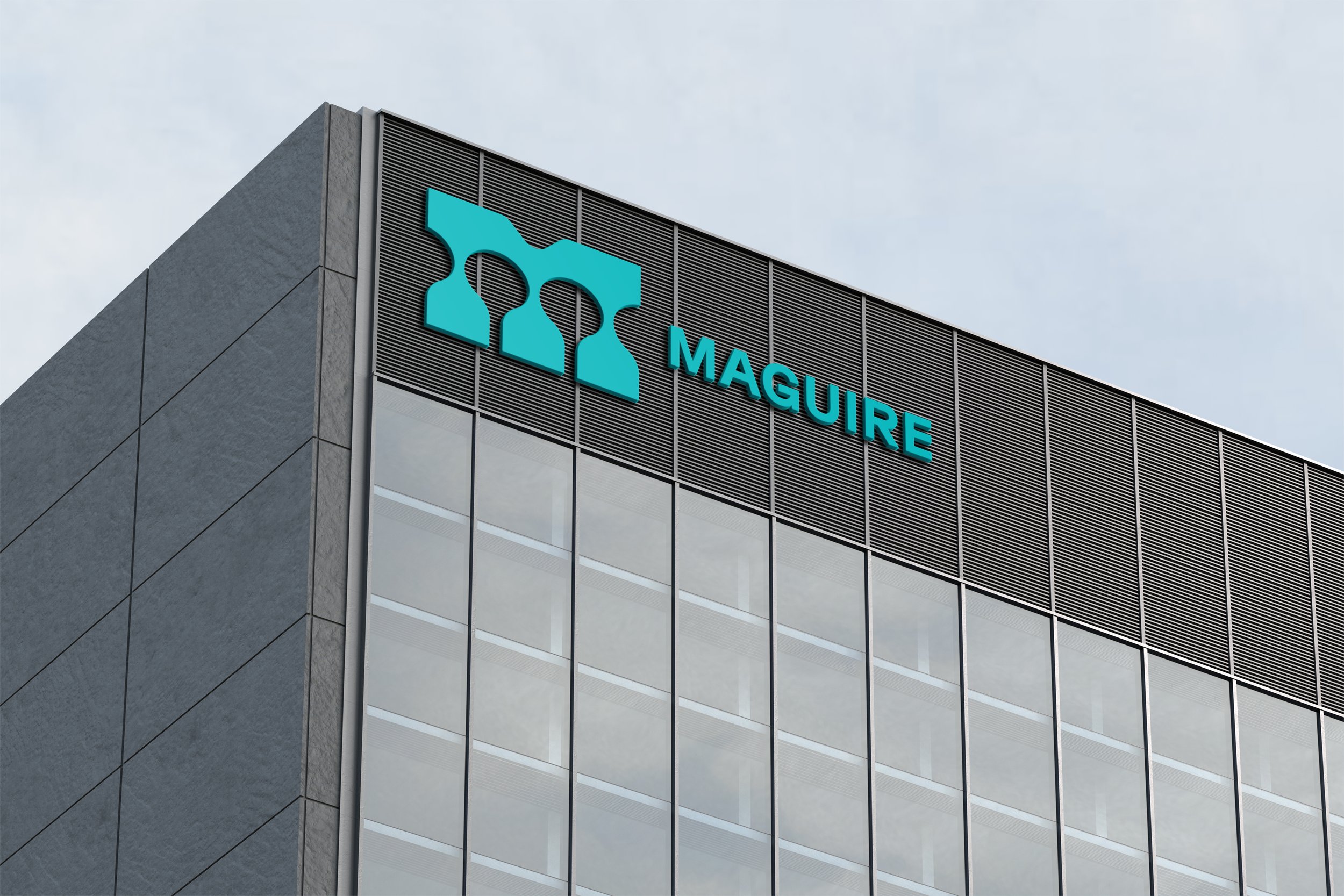
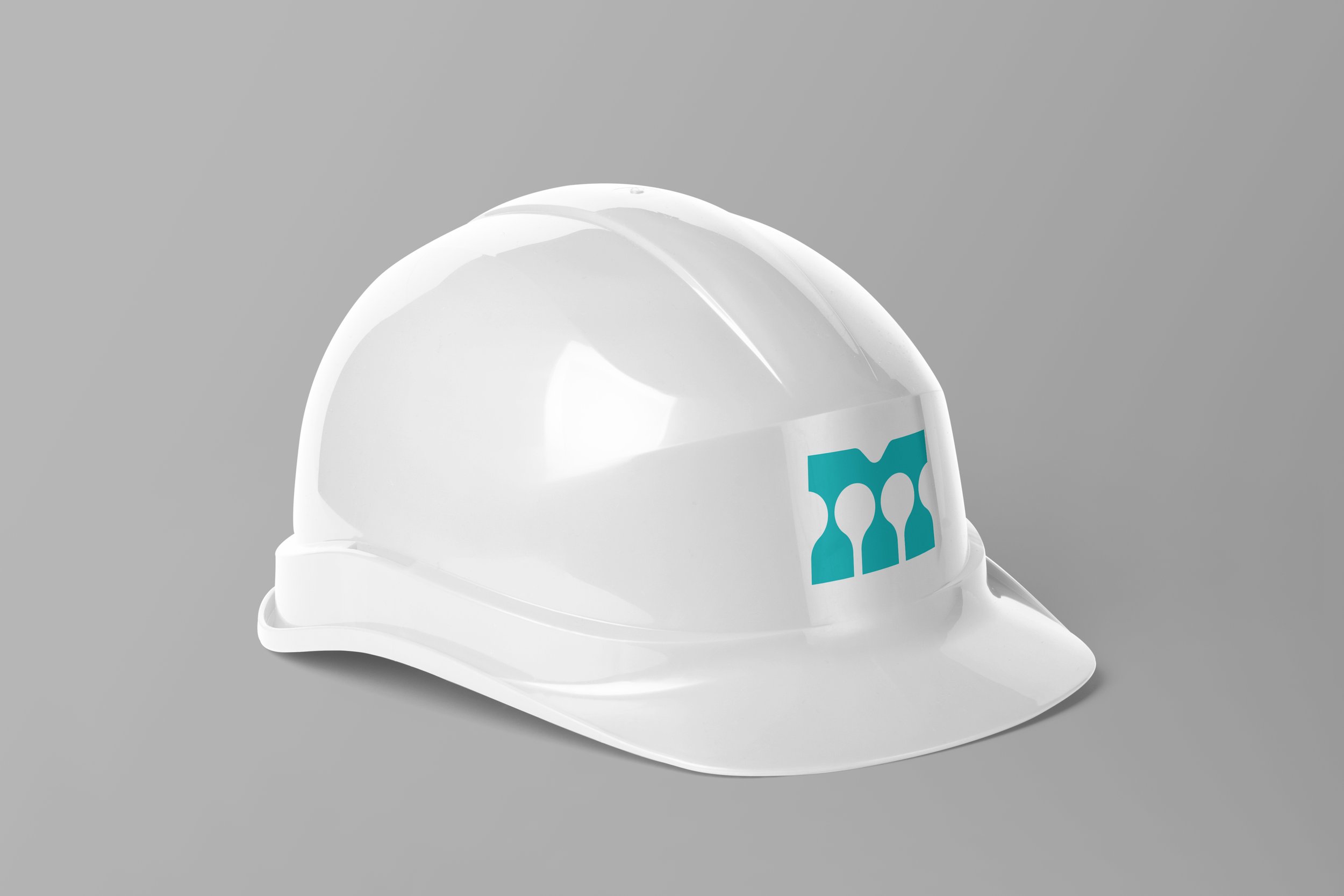
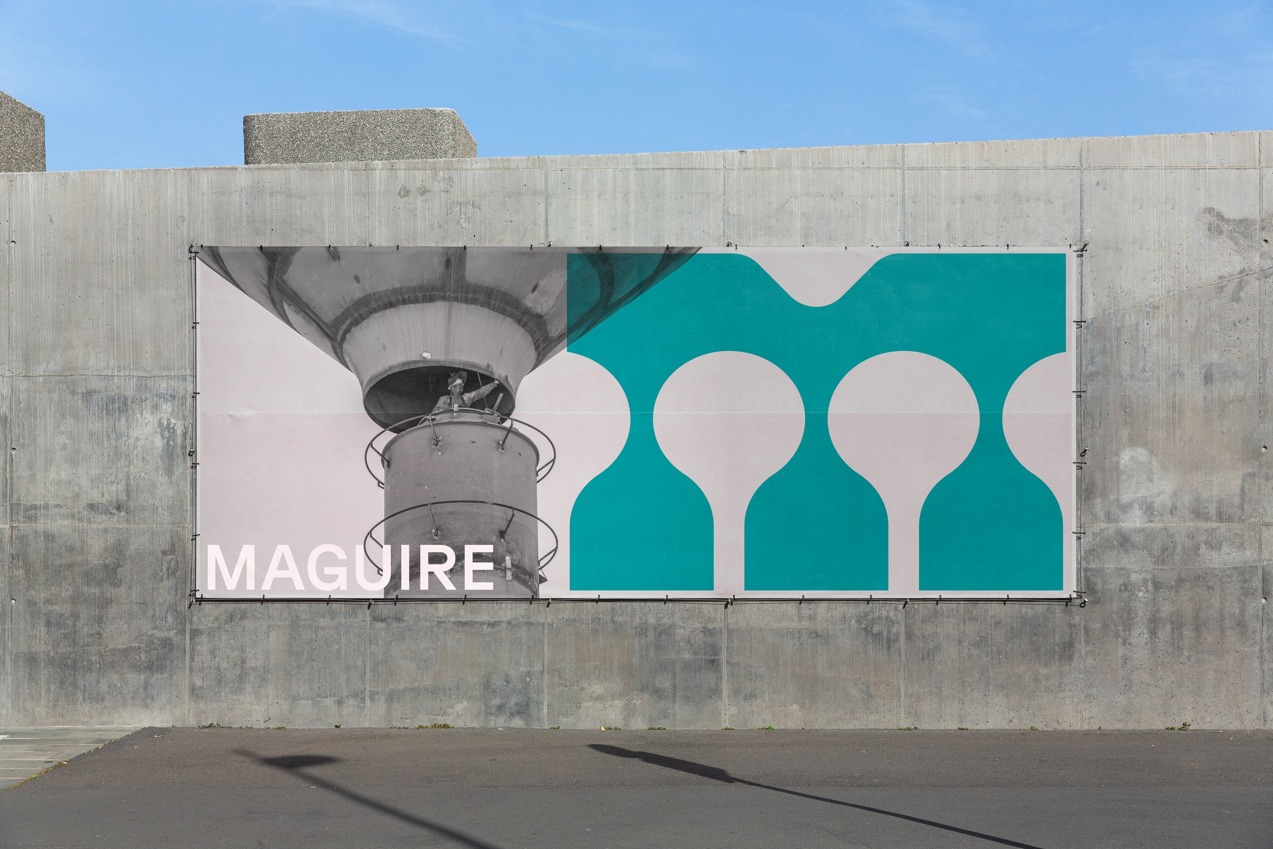
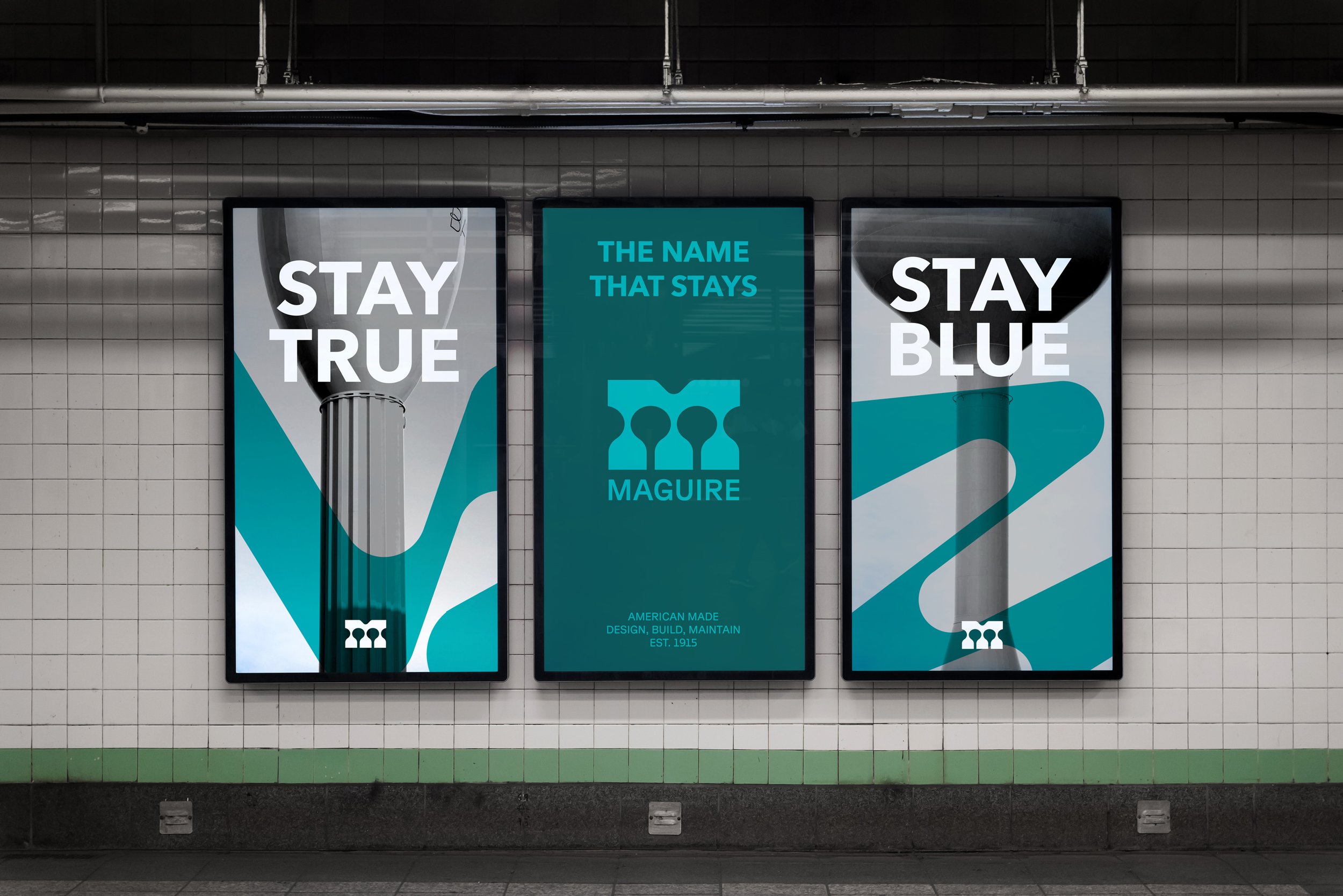
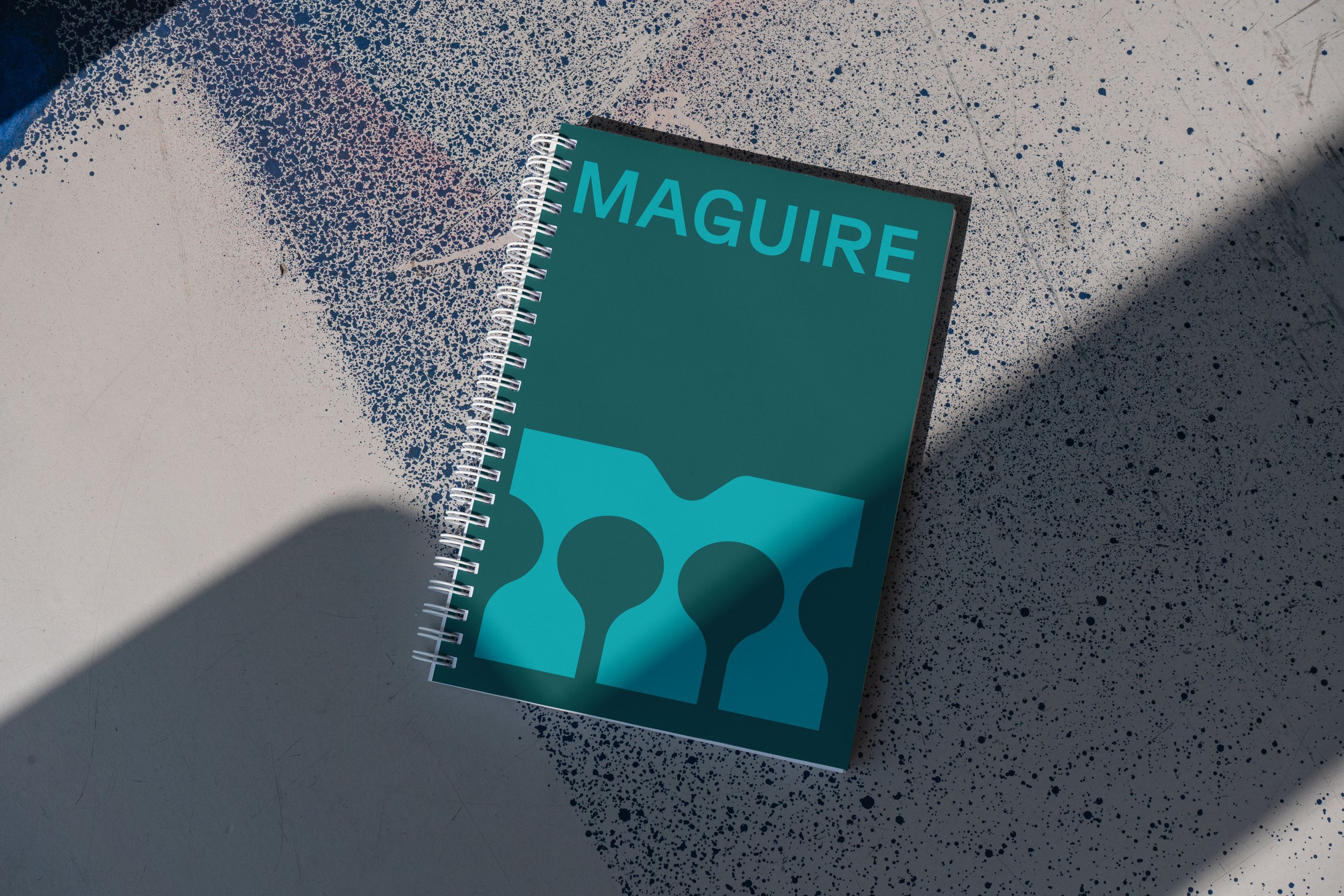
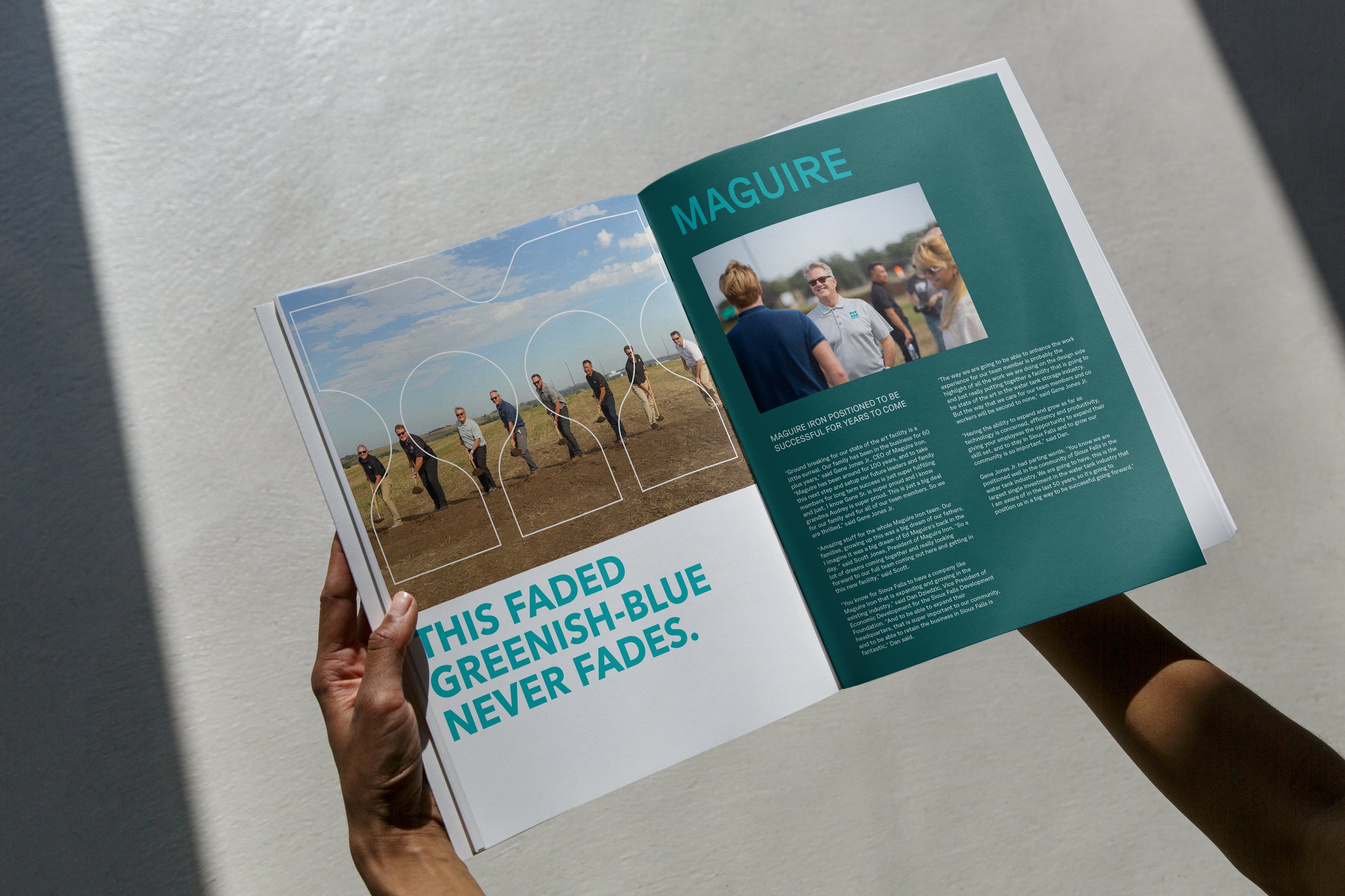
To share the new brand, we created a new visual identity and brand video to position Maguire as an industry leader, separate them from the competition, and ensure their enduring success for years to come. To elevate their iconic green color, we paired it with a distinctive symbol. Inspired by the photogenic stateliness of water towers against a sky backdrop, the rectangular symbol features silhouettes of spheroid water towers in the negative space, forming a robust M. Additionally, a “liquid M” was introduced as a graphic element to complement the logo in various layout compositions.
